Financial data connectivity is now widely adopted in online financial services as a way to streamline data collection—yet customer trust remains top of mind.
Businesses need a digital experience that’s highly effective at converting visitors into customers. And for this to happen, end-users must feel that data connectivity is the default option to access financial services.
That’s why we’re excited to roll out a UI refresh for Flinks Connect. With a clean, modern look and snappy connectivity experience, this update aims to help our clients achieve higher conversion rates and establish long-term trust with their end-users.
In a nutshell
- Speed—50% faster page load time when redirecting end-users to Flinks Connect for authentication
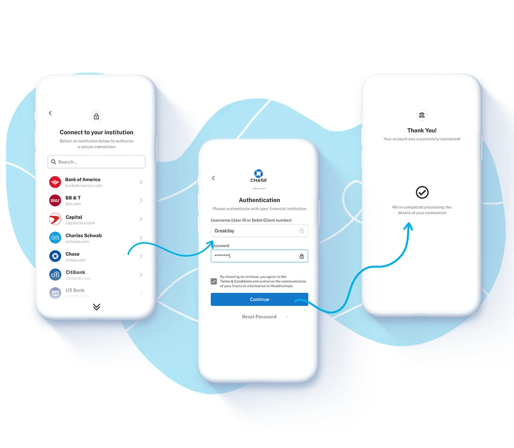
- Discoverability—our simple menu and convenient search bar are made for end-users to locate the right bank fast
- Modernization—an ultra clean and unopinionated UI overhaul that provides an efficient experience anyone can use
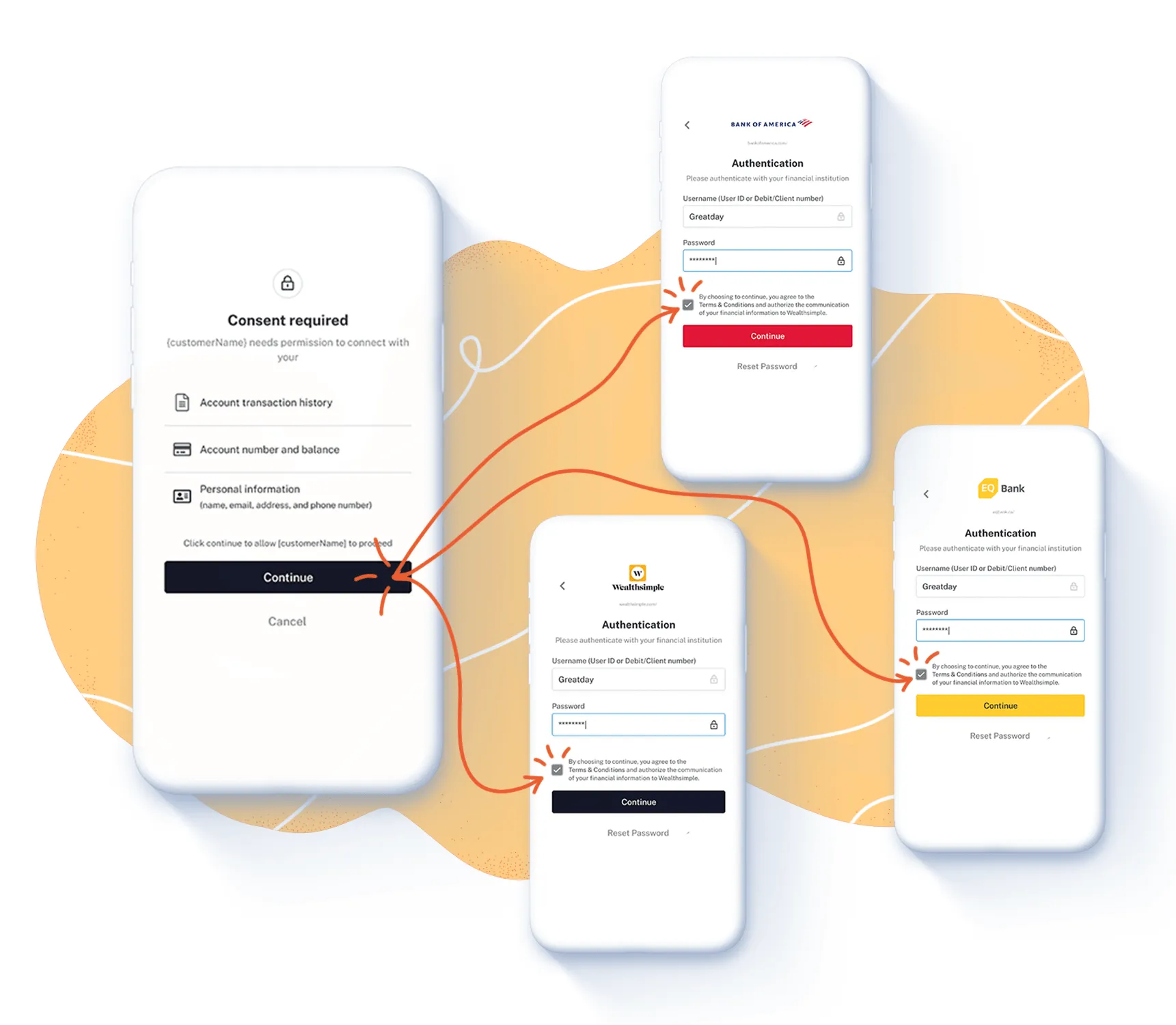
- Trust—an informed data sharing consent agreement, to build consumer trust with transparency
Optimizing user conversion is an art
With years of experience gathering insights from both clients on the business side and consumers on the end-user side, we set out to design the best converting aggregation product in the market.
Speed
First and foremost, site speed matters significantly to your conversion rate—even fractions of a second of longer load time can result in higher bounce rates and user drop-offs. Today, customers have greater expectations for a fast, responsive, and intuitive UI wherever they are online. Thus we completely rebuilt Flinks Connect’s infrastructure, which led to 50% faster loading time, for an experience that’s on par with other prominent websites they visit every day.
Discoverability
We updated the bank selection menu from a grid view to a simpler dropdown layout. This opens up more screen space and gives customers the ease to navigate. The search bar added on top of the list of banks was designed to increase discoverability by allowing customers to locate the bank on top of their mind. The new Flinks Connect simplifies the overall authentication workflow.
Modernization
More isn’t always better, especially when leading end-users to connect for the first time. The minimalist design of Flinks Connect therefore only highlights the designated bank’s title and iconography without other design elements. This will give your end-users more clarity regarding their selected bank for authentication, and give your business peace of mind when integrating our solution into your product, process, and brand, today and tomorrow.

Taking one step forward to enhance customer trust
Beyond feature improvements, this refreshed UI also represents Flinks’ efforts to help clients establish trust with their customers, at a time when data privacy and security is top of mind for everyone. That’s why we added an informed consent step to bring more transparency to the process of sharing their financial data with you.
Whether you are a financial institution or a fintech service provider, we want to help give your customers reasons to trust your products.

When asked to connect to their financial accounts, your customers have the right to know what will happen after they enter their credentials, and who will have access to their financial data. Adding a data sharing consent agreement does not hide the fact that your customers are using an aggregation provider as a trusted intermediary—in fact, it adds an extra layer of transparency to their experience with Flinks.
Setting the new default
Even if the industry as a whole is embracing financial data connectivity, it’s still a relatively new experience for consumers. These feature improvements are a meaningful step toward helping end-users connect with confidence—and ultimately accept data connectivity as the new default for sharing information.
Access is just a start. Moving forward, we will deliver updates and features to help you extract more value out of your customers’ financial data—and serve them better. Stay tuned for our upcoming revamped dashboard that will make data insights more consumable.
With Flinks, we pave the foundation in order to make financial data work for you, not the other way around. Are you ready? Roll out Flinks Connect today!


